Ivonne Gracia Murillo is a UI/UX/Graphic designer and researcher from Basque Country living in Vienna. She currently collaborates with different projects and clients as a freelancer, and is a team member of CartBrothers GmbH and the project wood-e.
Scroll vertically to browse projects and horizontally to explore each project.
Use the console on the left to change the appearance of the interface.
checkpointmedia website and branding revamp
In 2024, Vienna-based checkpointmedia GmbH, experts in the exhibition and cultural sectors with 23 years of international experience, took on a bold new chapter—new member to its management with a full brand and website revamp. With over 500 projects and 250 clients, the move to a new platform came with the mammoth task of migrating a vast archive across two languages.
For the new website, I drew inspiration from its history, blending contemporary design with a nod to its roots. The black background and navigational use of the brand’s symbol echo their first site from 2001. The iconic circular menus from 2006, which I found very innovative for the time, I reimagined as interactive, code-driven wheels. And my favourite: the horizontal layout, another callback, that ensures the site feels cohesive and navigable without endless scrolling or dropdown overload—a fresh take on design that values simplicity.
Offering users an archive of over 500 projects without forcing them to go into and out of each to see details, was a challenge to tackle. A single-page, user-friendly catalog was the answer, allowing seamless exploration of categories and filters without disruptive page changes. The result was a streamlined experience for visitors that honours checkpointmedia's legacy while pushing their digital presence forward.
Credit to Florian Windbacher for the hand with custom code on the catalogue!
And to Paula Sowerby for the new team pictures :) Always a pleasure to work with both of you. And many thanks to checkpointmedia for the opportunity to take up this website revamp and test the crazy stuff!


Redesigning checkpointmedia's print portfolio
After checkpointmedia's rebranding, they needed to have their printed portfolio redesigned. I invited Karl Kaisel to join me and together we updated it to align with their refreshed branding. We reduced the amount of text, maximised space for images, and introduced new projects while updating some visuals for existing ones.
Each project includes a QR code that works in both print and digital PDF formats, linking to the website for more detailed information.
We rounded the corners of images and pages to reflect the new visual identity, and added an anti-scratch laminate to the cover and back cover, along with a smooth-touch finish.
Glue-bound version mock-ups: Karl Kaisel
Management portraits: Paula Sowerby
Year
2024
Location
Vienna
Client
checkpointmedia GmbH


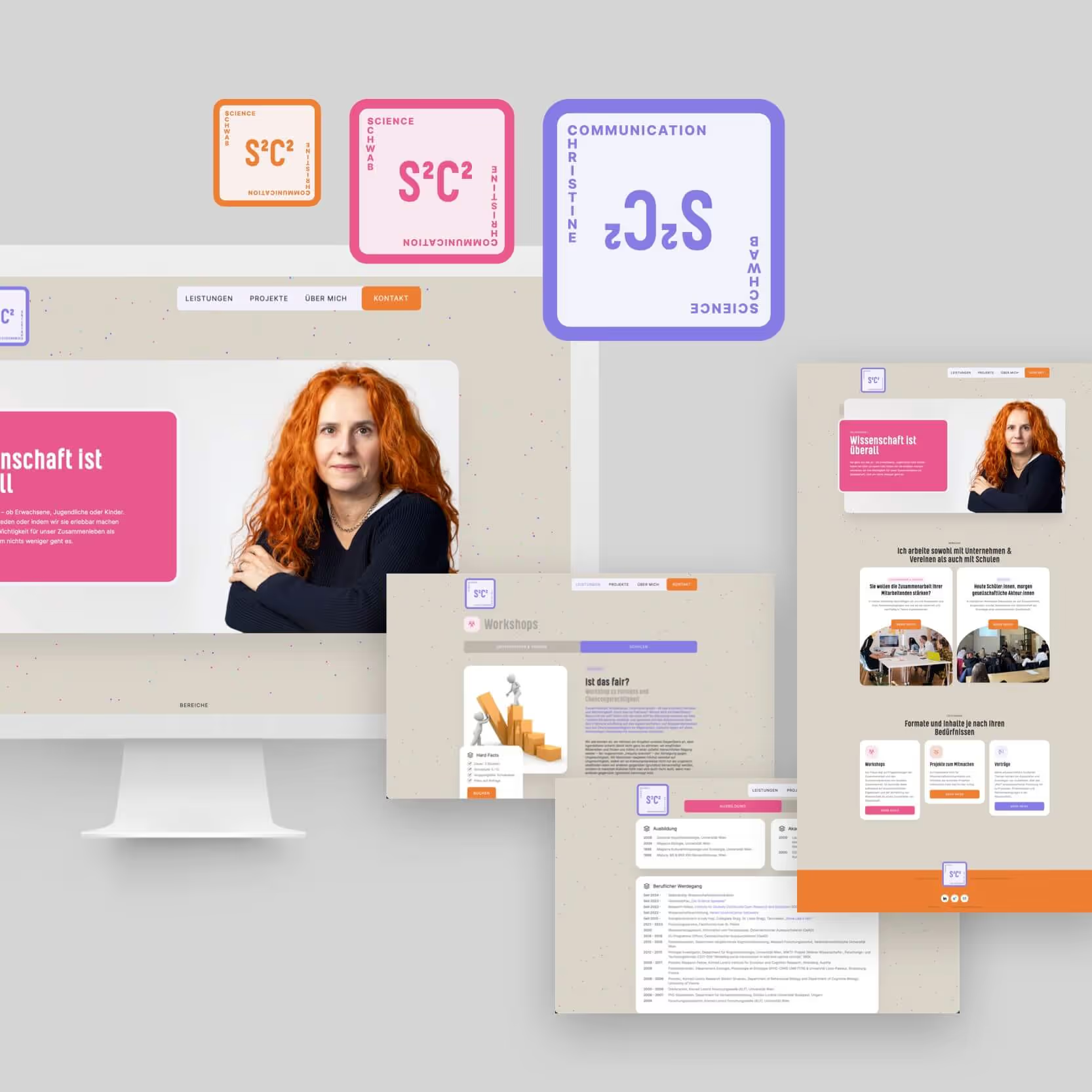
S2C2 branding and website
A science communication website with live generated particles.
Christine is a cognitive scientist who launched her self-employed venture as a science communicator in 2024. To support this, she needed a brand, a website, and business cards.
Christine envisioned an energetic, playful, and accessible brand. Combining her initials with those of her service, and the mathematical concept of exponentiation, to the power 2 (S²C²) we went for a logo and business card that playfully reflect this idea, allowing them to be flipped to reveal the combination.
To enhance her website, I added a couple of interactive details: a logo that rotates when hovered over and a background of hundreds of randomly generated colourful particles that react to the mouse’s movement, speeding up and avoiding the cursor. Even the typically dull Imprint page comes alive with this playful, interactive trick.


Close

AR Posters
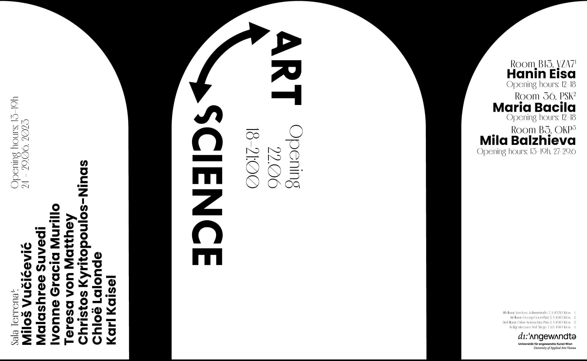
In 2024, the closing exhibition of the project was hold at the AIL Vienna, for which another poster and a pamphlet map were created.
Based on the graphic identity we already developed with Francesco Dipierro and Karl Kaisel back in 2022, Maximilian Gallo and me added AR (Augmented Reality) to this poster.
We had use the same tool one year before, for the poster of the exhibition of the Art&Science Department final master theses, at the University if Applied Arts Vienna. The room was called Sala Terrena and was built in a basement under huge white arches. The poster, made by Karl Kaisel, referred to these arches, in a very simple palette of black and white, as the works on display were very different and unrelated to each other.
Using this very neutral base, we added excessive and fun effects to the image using social media filters, which together formed a dynamic and varied promotional video.

Try it with Artivive
If you download the free app Artivive (developed in Vienna) on your phone, you can point your camera to the image of the poster above these lines, and it will still work (sound included).
About AR on posters —>
radical⇌matter Branding
radical⇌matter is a PEEK research project involving teams from the Royal Academy of Arts in London and the Univ. of Applied Arts Vienna. Our team defined the visual identity of the project, and created the assets for the first exhibition at Künstlerhaus Vienna
in June 2022, From there through here. Every application and asset’s visuals were extracted from the original radical⇌matter lettering that embodied the project’s theories of encounter, emergence and superposition.
Visual Identity developed with the best: Francesco Dipierro, Karl Kaisel and Maximilian Gallo.
In 2024, the closing exhibition was holded at the AIL Vienna, for which another poster and a pamphlet map were created.
Year
2022
Location
Vienna
Client
radical⇌matter Project, Univ. of Applied Arts Vienna
Link
kuenstlerhaus.at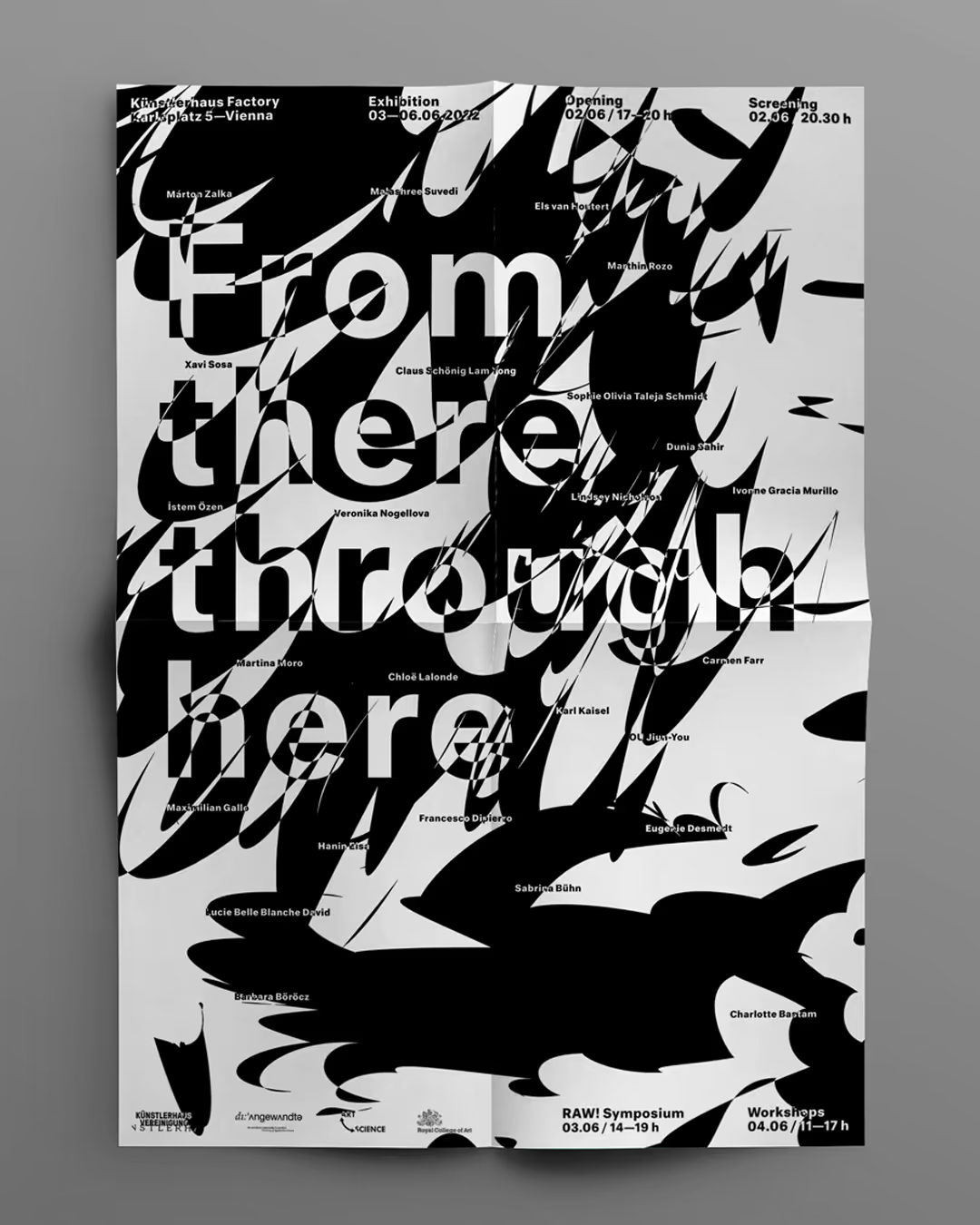


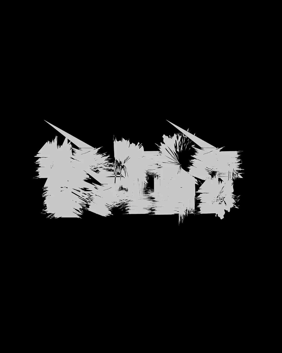
Process experiments for radical⇌matter's branding
radical⇌matter is a PEEK research project involving teams from the Royal Academy of Arts in London and the Univ. of Applied Arts Vienna. These are experiments I produced while taking part in the process of creating a branding for the project.


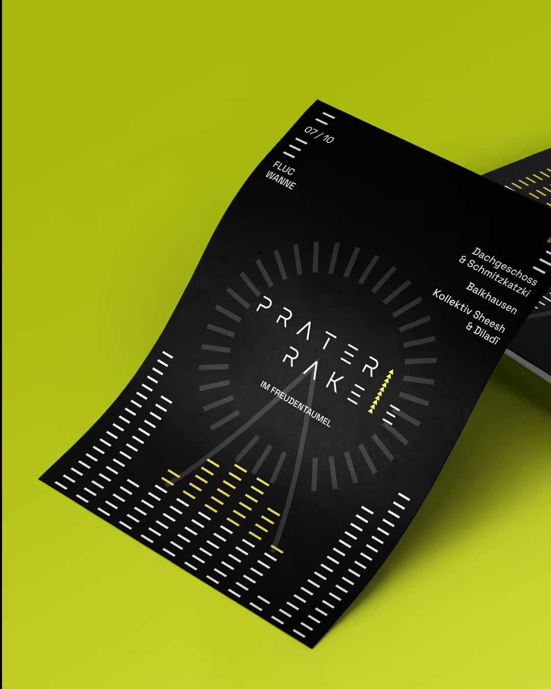
Wiener Rakete Branding
Made this identity with some print and digital assets for my friends at @wiener.rakete 🤍 a Vienna based techno party organisation, with guest djs from all over Europe. These included instagram templates and some animated assets, poster and flyer print templates and several logos for their individual parties over time.
Year
2021
Location
Vienna
Client
Wiener Rakete


Website for The Elsewhere Project - Fužine
A project from the Art&Science Master program at dieAngewandte Vienna, that took place in Fužine/Lič, Ukraine, organised by Marko Markovic within the program of Rijeka European Cultural City 2020.
The site showcased their work during workshops with the local kids, their own artistic investigations in the field a gallery of the video pieces and downloads of their FuZine magazine issues. It was the online exhibition and point of information of the related events during Covid-19’s first academic year finals.
Year
2020
Client
Art&Science Master Department,
Univ. of Applied Arts Vienna
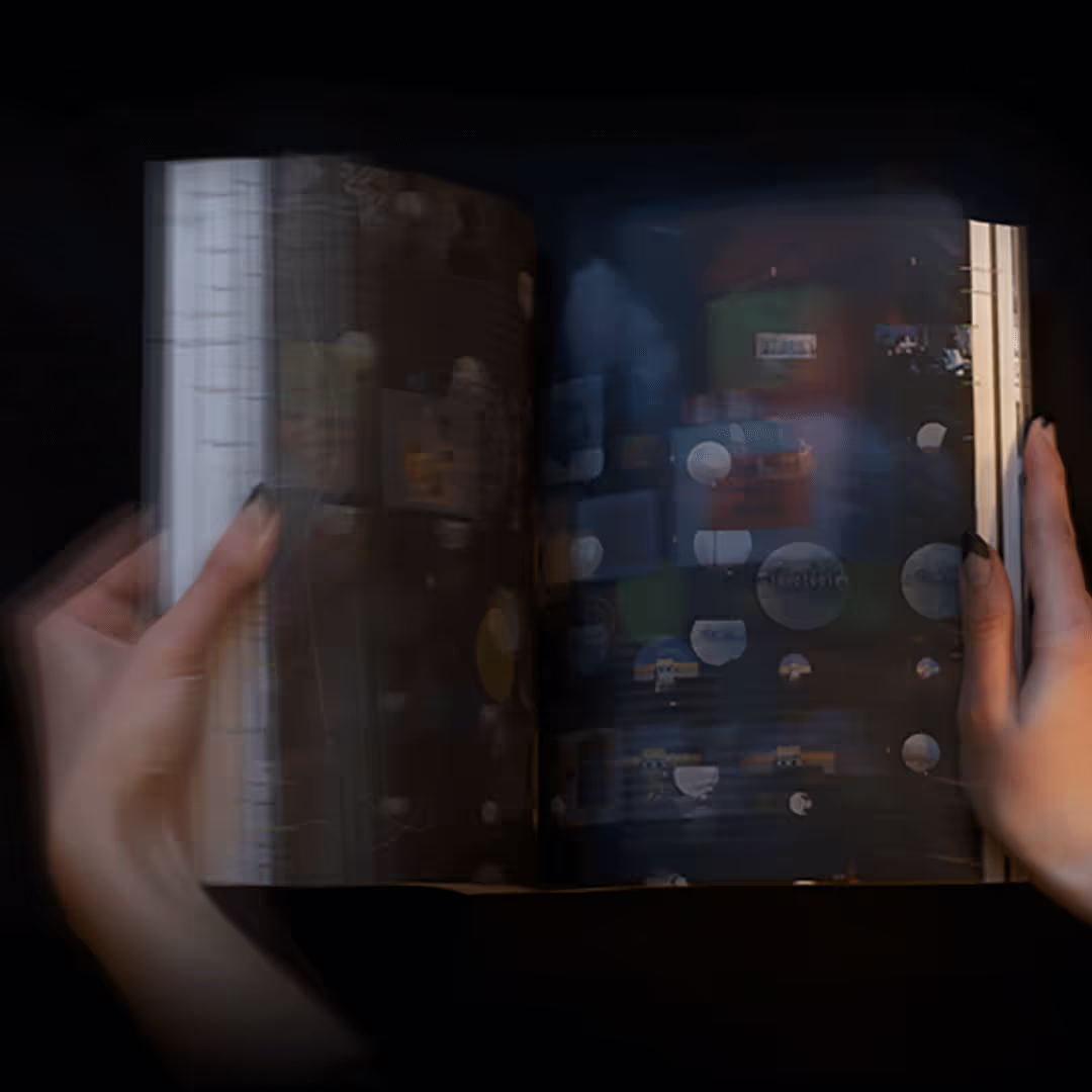
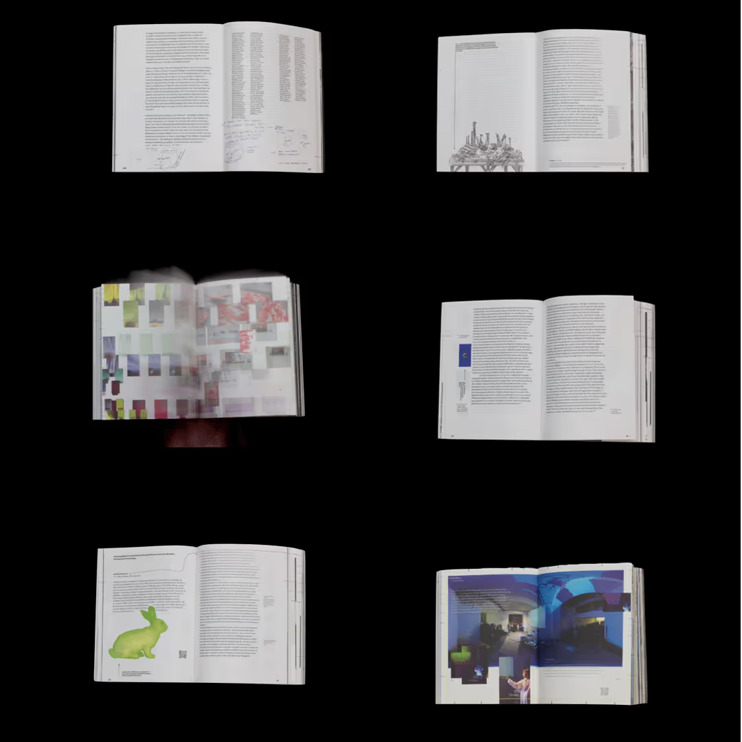
Data Loam Book
The table of contents in the middle of the book showcases all authors and artists, whose names code the color lines that spread from there to both sides, arriving at their articles and art pieces. So does the map of the exhibition catalogue, which lines can be followed from the top or bottom of the map page until the page showcasing the room where the pieces where exhibited.
All the video pieces in the exhibition are accompanied in the catalogue by AR technology that showcases the full length of the pieces on the book itself, using Artivive App.
The animated piece showcased in the video is from artist Nora Lengyel.
Designed with Maximilian Gallo 🤜🤛
“Data Loam. Sometimes Hard, Usually Soft. The Future of Knowledge Systems”, published by De Gruyter, edited by Johnny Golding, Martin Reinhart and Mattia Paganelli, (2021)


Data Loam Book Prototype
An installation of the research that informed the book Data Loam later on.
Before all the research, ideas and various manifestations of the Data Loam project were collected and compiled in the book that came to be published by De Gruyter in 2021, in a time in which only the core concepts of Data Loam floated around our briefing and no final content had yet been created, we were granted with the opportunity to begin our design research for the future publication, long before this was to come. This allowed us to peel away the preconceptions about what a scientific publication should look and work like from the Data Loam concept
Our experiments, which are further detailed in our essay Book Designing in the Age of the Loam, immediately following the catalogue within the publication, first materialised in a prototype of paper, metal and magnetic sheets. It was to bean ode to the very nature of the Data Loam project, a book without constraints, a free and yet rigorous tome, that would entice the reader to engage playfully with its content. Our goal was to give away control, to let the data entwined within the books pages become its own entity, its own agent.
The prototype was exhibited together with selected pieces of research in an installation at AIL Vienna in February 2019, during “Data Loam. Sometimes Hard, Usually Soft” exhibition, curated by Johnny Golding and Martin Reinhart.
__
Made with: Maximilian Gallo, Monica C. LoCascio, Istem Özen
The Design team wants to thank Martin Reinhart and Johnny Golding for an unusual complete freedom of creativity and the exceptional chance of sharing with readers the concept and core of the design in the book itself. Georg Hirzinger, for making our wicked ideas reality while constructing the book prototype; Michael Waismayer, for a clean laser cutting work of magnetic grid sheets and Kai Bernau, for a typeface that embodied our view.


“Book Designing in the Age of the Loam”
By Ivonne Gracia Murillo, Monica C. LoCascio and Maximilian Gallo
Published by De Gruyter in Data Loam. Sometimes Hard, Usually Soft. The Future of Knowledge Systems, edited by Johnny Golding, Martin Reinhart and Mattia Paganelli, (2021)
As the design team for the Data Loam publication, we were granted with the opportunity to begin our design research long before the project was collected for the final book, based only in what the concept of “Data Loam. Sometimes Hard, Usually Soft” represented.
We created the design of the publication in three stages:
Beginning with many sessions where we work, from many different angles, on what stays within the limits of what a book is, or outside them. Not influenced by having to produce a marketable publication, we instead spent a lot of time figuring out what we thought could be the ideal embodiment of the project concept.
The second stage was to design a prototype that would encompass the manifestation of these ideals. This prototype was installed at the Data Loam: Sometimes Hard, Usually Soft exhibition.
The third and final stage of the process was the translation of what we had dreamt and built before into a printable and affordable book. Our experiments, solutions and ideas that came from them are further detailed in our essay Book Designing in the Age of the Loam, immediately following the catalogue within the publication.
___
The Design team wants to thank Martin Reinhart and Johnny Golding for an unusual complete freedom of creativity and the exceptional chance of sharing with readers the concept and core of the design in the book itself.


